
Typesetting with DrawBot

From Characters to Glyphs
The question we still need to answer concerning text is how to draw it. Let’s observe the process of typing on a keyboard:
- a key is pressed (usually with a finger, sometimes by your cat)
- a number mapped to that key is sent to the Operating System
- the OS converts the number to a character using an encoding – most of the times the reference is Unicode
- the character is drawn on the screen with a custom or standard font


The drawing of the character appearing on the screen does not come from the Unicode encoding itself. It is stored in a different container: a font. The Unicode encoding is only an intermediate dictionary used to pick the right drawing from the font. In fact the Unicode encoding contains only characters descriptions and their organization. A font file is the translation of the typographer’s case to digital data. The term commonly used for the prefabricated representation of a character is ‘glyph’. Think of the character as an abstract idea, a collection of common features that make a sign recognizable as such. For example, let’s describe the notion of a capital A we mutually share: two diagonal lines connecting on top and diverging at the bottom plus a horizontal bar intersecting with both diagonal lines, usually placed halfway between top and bottom. It is a rather generic description. Many different drawings can fall into that. They can have serifs or not, they could be stenciled, they could be fat or thin, wide or narrow, and so on. Take also into account that many representations could be recognized as capital A and fall outside that description. It’s hard, or maybe impossible, to put together the right description.

During the era of metal type, lead glyphs were stored into special drawers with a standard organization. Did you know that terms uppercase and lowercase derive by such organization?

These drawers were then stored into cabinets. Usually, a cabinet would contain different related sizes or styles. Related how? Well, they would share some formal features that would make them look related, as the different faces of people who are part of the same family.
In fact, this kind of collection forms a font family. Note that the term typeface is instead used to refer to the common features shared across a collection; it is a way more abstract terminology.

As you may have inferred, at that time, each font (think about the cabinet’s drawer filled with metal type) was size-specific. Things changed after the introduction of cubic and quadratic outlines, when a font was not tied anymore to a specific size. Nevertheless, reading distance and body size are still crucial aspects in the reading experience. Our eyes did not change with the digital transformation of typography. So, when using a font, check if the designer made it with a specific range of sizes in mind; even if you are allowed to scale it to any size without losing detail.
Setting One Line of Text
The minimum setting action in DrawBot related to type is the composition of single lines of glyphs. In order to do so we have to make a number of decisions upfront:
- which characters have to be drawn, the content
- the position of the text line on the canvas
- the font from which the glyphs should be picked up
- body size
- fill and stroke color
DrawBot has some fallback options if we are too lazy to specify all of them. But content and position are mandatory. They are, in fact, the arguments of the text() function:

newPage(100, 100)
text('a quick brown', (20, 20))
The origin of the position coordinates is the lower left point of the composition. Take into account that the first glyph might have some left margin, meaning that the black shapes will not touch the coordinate point. You can simply test the behaviour:

newPage(100, 100)
rect(0, 0, 20, 20)
text('a quick brown', (20, 20))
The other choices have to be set with specific functions and must be defined before the text() function is invoked.
font() defines the font used to draw the characters. It accepts a string argument. It should be the name of a PostScript font already installed on your computer.

newPage(200, 200)
text('a quick brown', (30, 60))
font('Andale Mono')
text('fox jumps over', (30, 40))
DrawBot provides a function able to make a list of the PostScript fonts installed on your computer. installedFonts() accepts an optional string argument with characters which should be supported by the listed fonts.
For example, you could use it in the following way:
for eachFontName in installedFonts(supportsCharacters='ЉДЖ'):
    print(eachFontName)
The names printed in the console are the fonts that support the 'ЉДЖ' cyrillic characters.
The body size is handled by the function fontSize(). It accepts a numerical value either an integer or float. The function sets the size in PostScript points, the default being 10pt.

newPage(200, 200)
text('a quick brown', (30, 80))
fontSize(20)
text('fox jumps over', (30, 40))
Color and stroke are defined by fill() and stroke().
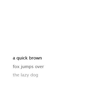
newPage(200, 200)
fill(0)
text('a quick brown', (30, 60))
fill(.4)
text('fox jumps over', (30, 40))
fill(.6)
text('the lazy dog', (30, 20))
Once defined, these settings will be applied to all shapes drawn afterwards. To change these options. just call the functions again.
Setting Multiple Lines of Text
Typesetting is a discipline whose goal is to arrange language within a set of physical constraints. These limits are usually the borders of the canvas. This is why a long sequence of characters cannot be displayed in just one line. The sequence has to be broken in multiple lines.
We are used to sequences of broken lines of text. These entities are the building blocks of typesetting, they are called paragraphs. When approaching the typesetting of a paragraph we should take into consideration a few extra options compared to a single line.

First of all, we should use a different function than text(). It would be possible to deal with line breaking ourselves, but DrawBot is generous enough to provide a function which will take care of it automatically: textBox(). Unlike text(), the glyph sequence fits into a rectangle. The function accepts a string as first argument, followed by what’s necessary to define the rectangle (x, y, width, height) and, as optional argument, the alignment of the text.

someText= """Considerare l’esistenza di un insieme di strumenti convenzionali di organizzazione e interpretazione dello spazio concatenati, il quale in qualche modo interagisca con la lingua parlata, è utile perché conviene dal punto di vista progettuale"""
newPage(200, 200)
textBox(someText, (20, 30, 150, 150), align='left')
If you want to see the box which contains the text, just use a rect() function with the same arguments:

someText = """Considerare l’esistenza di un insieme di strumenti convenzionali di organizzazione e interpretazione dello spazio concatenati, il quale in qualche modo interagisca con la lingua parlata, è utile perché conviene dal punto di vista progettuale"""

newPage(200, 200)
myBox = (20, 30, 150, 150)

fill(.8)
rect(*myBox)

fill(0)
textBox(someText, myBox, align='left')
If some text does not fit the provided rectangle, textBox() will return it. This feature, combined with a while loop, can be used to add new pages until the text is all set on canvas.

someText = """Considerare l’esistenza di un insieme di strumenti convenzionali di organizzazione e interpretazione dello spazio concatenati, il quale in qualche modo interagisca con la lingua parlata, è utile perché conviene dal punto di vista progettuale: porre il testo in contrapposizione all’immagine è utile solamente a replicare un modello di editoria libraria affermatosi alla fine del XV secolo, vincolato dalle tecniche produttive esistenti all’epoca (stampa a caratteri mobili e xilografia) e applicabile in buona sostanza principalmente all’editoria libraria legata alla narrativa, che è solo una piccola parte della produzione scritta."""

myBox = (20, 30, 150, 150)
while someText:
    newPage(200, 200)

    fill(.9)
    rect(*myBox)

    fill(0)
    someText = textBox(someText, myBox, align='left')
Most of the decisions we have to make when setting multiple lines of type have to do with the space surrounding the glyphs. Of course, fonts already provide some standard concerning proportions between glyphs, but a typographer has a few tools to enhance the composition according to a specific context.
The vertical distribution of space in a paragraph is handled by the lineHeight() function. It is commonly called leading, a term which comes from the metal days of type. It refers to the stripes of non-printing metal which would be inserted between lines of type. In a digital environment the leading value defines the distance between one baseline and the next.

Take also into account that the are no physical restrictions on a digital canvas, meaning that the leading value can be inferior to the body size or even negative.

someText = """Considerare l’esistenza di un insieme di strumenti convenzionali di organizzazione e interpretazione dello spazio concatenati, il quale in qualche modo interagisca con la lingua parlata, è utile perché conviene dal punto di vista progettuale"""

newPage(200, 200)
lineHeight(24)
textBox(someText, (20, 30, 150, 150), align='left')

newPage(200, 200)
lineHeight(16)
textBox(someText, (20, 30, 150, 150), align='left')
The DrawBot default is pointSize * 1.2.
Fonts already contain a lot of information concerning the horizontal distribution of space. As we saw in the previous chapters, white is as important as black. A type designer will provide the font with all the necessary data to compose a good paragraph of text. Think twice about overriding this information. It is a distortion of type as much as a non-proportional scaling. Well, maybe a bit more subtle, but a trained eye will recognize it immediately.
But, there are a few cases where it makes sense to alter the composition with some inner-character extra space. The tracking() function is here for this. Tracking –not to be confused with kerning– is the injection or subtraction of a fixed amount of white space between the glyphs. Text composed at small size, like 8pt, could benefit from some extra spacing.
Breaking the lines of text could be painful for the visual quality of a paragraph. But, let’s face it, we have no other option: either we break the lines or we compose only poetry. Minimizing the negative effects of line breaking is part of a typographer’s job. There are decisions that influence the quality of the right side of a paragraph more than others: average font width in relation to box width, justified alignment versus ragged alignment and hyphenation, etc.
Hyphenation is a feature which allows the digital composer to break a line using word syllables, not only spaces between words. This option adds many breaking options making the process of breaking a line less harmful for the paragraph of text. Having said that, reading a word split on two lines could be not that comfortable, especially if we are not very used to it or if the word is very short.
Take into account that syllables have different definitions across different languages, so remember to set the right language using the language() function. The default is English.

someText = """Considerare l’esistenza di un insieme di strumenti convenzionali di organizzazione e interpretazione dello spazio concatenati, il quale in qualche modo interagisca con la lingua parlata, è utile perché conviene dal punto di vista progettuale"""

newPage(200, 200)
hyphenation(True)
language('English')
textBox(someText, (20, 30, 150, 150), align='left')

newPage(200, 200)
hyphenation(True)
language('Italian')
textBox(someText, (20, 30, 150, 150), align='left')
Hyphenation settings resonate enormously with the justified alignment. This method of composition creates an even right edge by injecting extra space between words. Too much extra space makes the paragraph very uncomfortable to read, so the ability to break the line within a word is critical.

In other words, if a paragraph has a narrow width, justified alignment and no hyphenation, it is very likely that the word space will start to appear across consequent lines emerging from the paragraph texture. These are the so-called rivers.
exercise 11.1
Create a paragraph with many "rivers" of white.

someText = """Considerare l’esistenza di un insieme di strumenti convenzionali di organizzazione e interpretazione dello spazio concatenati, il quale in qualche modo interagisca con la lingua parlata, è utile perché conviene dal punto di vista progettuale: porre il testo in contrapposizione all’immagine è utile solamente a replicare un modello di editoria libraria affermatosi alla fine del XV secolo, vincolato dalle tecniche produttive esistenti all’epoca (stampa a caratteri mobili e xilografia) e applicabile in buona sostanza principalmente all’editoria libraria legata alla narrativa, che è solo una piccola parte della produzione scritta."""

myBox = (10, 30, 180, 150)

# justified alignment with no hyphenation makes no sense
newPage(200, 200)
hyphenation(False)
textBox(someText, myBox, align='justified')

# hyphenation helps, but it’s still far from optimal
newPage(200, 200)
hyphenation(True)
textBox(someText, myBox, align='justified')

# choosing the right language improves the composition
newPage(200, 200)
hyphenation(True)
language('Italian')
textBox(someText, myBox, align='justified')

# in this case I would just align to the left
# I see no problems in a slightly uneven right edge
# designers complaining about it only consider
# the frame and not the content
newPage(200, 200)
hyphenation(True)
textBox(someText, myBox, align='left')